ContentGrapher
← Changelog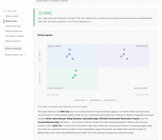 Every dot in the priority matrix now surfaces the specific concept it addresses. Hover a dot and the tooltip reads "Clarify: breed popularity" or "Make explicit: embedding quality → search accuracy", not a truncated paragraph. The same label appears as a heading on each guidance card, so mobile users get the same scannability without hover. All existing reports were backfilled.
ImprovedMay 30, 2026
Priority Matrix Action Summaries
You can now see exactly which concept each writing task addresses at a glance. Hover any dot to see "Clarify: breed popularity" instead of a truncated sentence fragment.
Problem
Scanning the priority matrix required clicking through to each guidance card to understand what a task was about. The tooltip showed a truncated instruction sentence cut off mid-word, which took longer to parse than clicking through directly. On mobile, there was no preview at all.
Context
User feedback on the writing agenda: the matrix is useful for seeing how many tasks fall in each quadrant, but useless for identifying which task is which without clicking every dot.
Why now
The writing agenda is now the primary action surface in the report. If the user cannot scan the matrix and orient themselves in under two seconds, the visual is decorative rather than functional.
What changed
Every dot in the priority matrix now surfaces the specific concept it addresses. Hover a dot and the tooltip reads "Clarify: breed popularity" or "Make explicit: embedding quality → search accuracy", not a truncated paragraph. The same label appears as a heading on each guidance card, so mobile users get the same scannability without hover. All existing reports were backfilled.